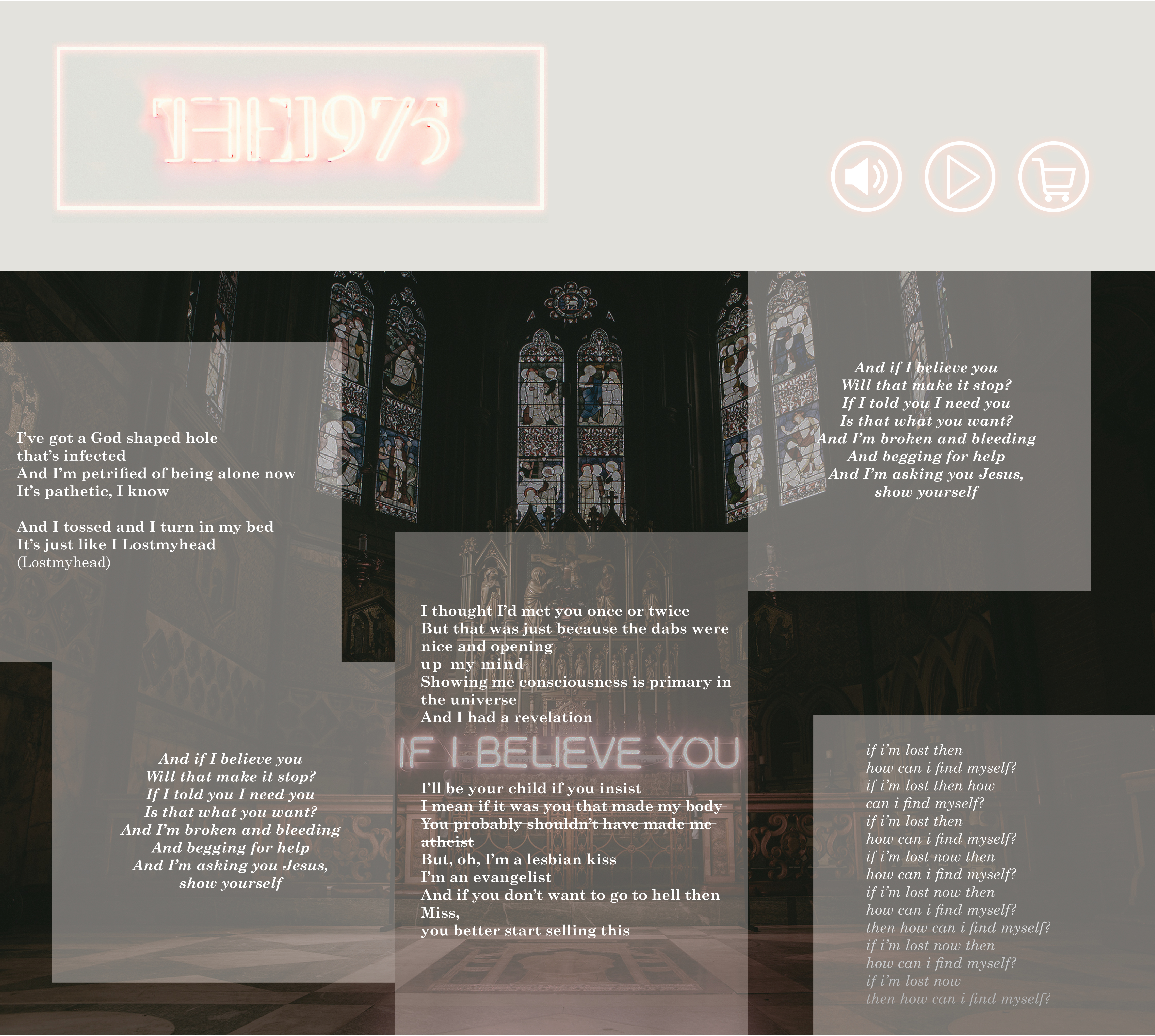
Improvement Plan - Neema Samawi
Original Design
Suggestions Made During Peer Review
- Try a serif font to better fit the gothic aesthetic of the image
- Reduce the contrast in the background image to make it less distracting
- Tie together the name of the artist and the title of the song
- Make the alignment of the text within the boxes more consistent (made chorus centered, all others left-aligned)
- Increase the padding within the textboxes
- Include interactive elements
- Differentiate the chorus and have it repeat
- Have background image stretch out to the edge of the screen
Names of Partners: Katie Heider, Jee Eun Kim
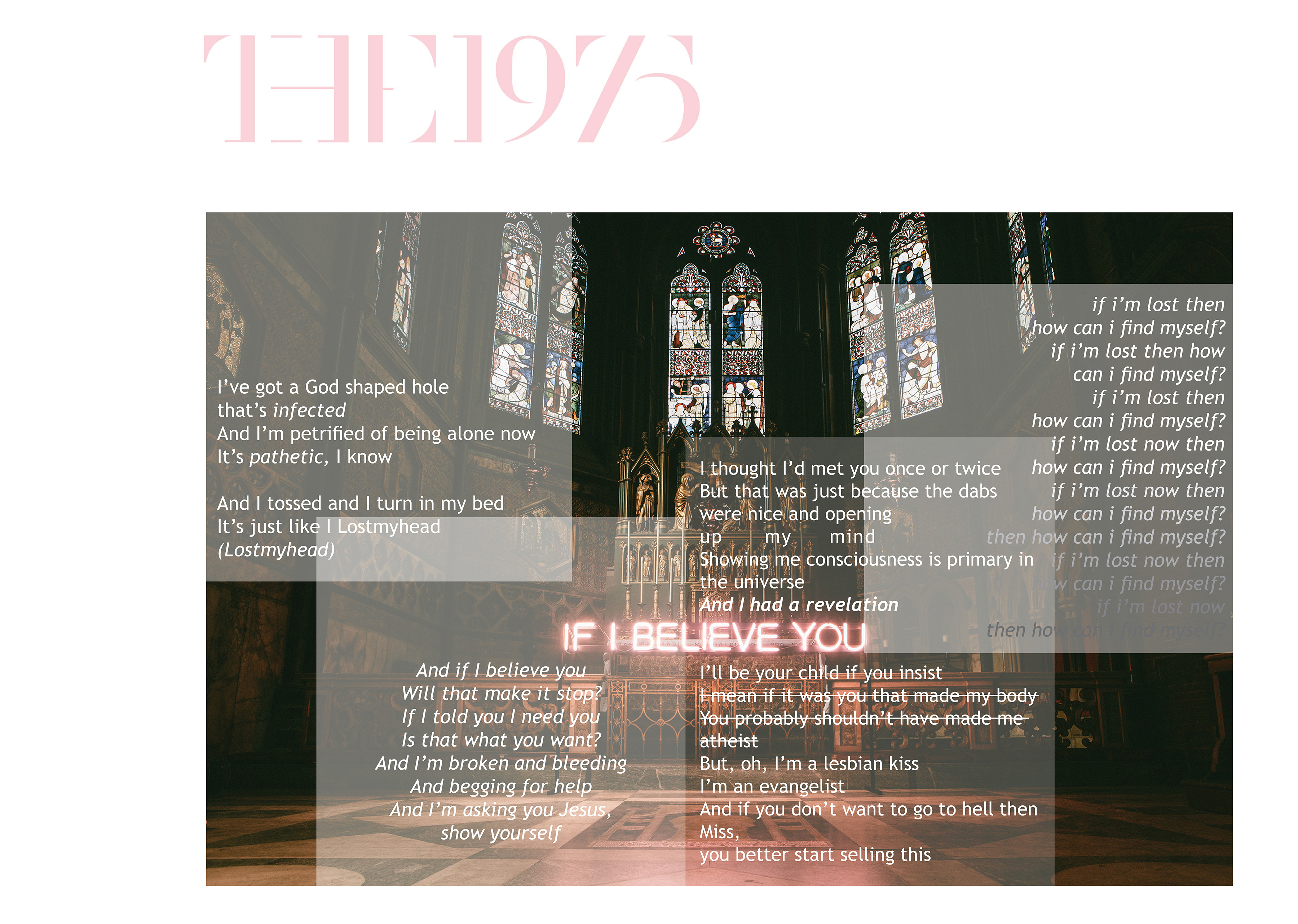
Refined Design